Design Guide
Suggested screens for the FXaaS UX flow.
This Design Guide is intended to help our partners with great design suggestions for improving the customer experience throughout the FXaaS. These guidelines go into the entire customer journey on the FXaaS and how each step can be conducted based on what we, at Remessa Online, offer to our customers. In this context, we will comment on each screen's purpose and what best practices can be used by our partners to deliver a fantastic experience to the end user.
Guides and screen suggestions will be presented for these three use cases:

Design Use Cases
Each use case has its own specificities. Below you can see some details about each one:
-
Use Case 1: Individual Customer
The customers that will interact with the application will be individual customers. This means that the screens shown will have their fields and flows directed to this type of customer. In addition, it will be possible, within this use case, to follow both the money-sending flow and the money-receiving flow. -
Use Case 2: Investment Customer
Although the customers who will interact will be individual customers, because the purpose of the transaction is exclusive to investment, it is necessary to display different fields and screens that are more aligned with this type of transaction. In this use case, the screen flow for making an investment application and investments returning will also be available. -
Use Case 2: Company Customer
For this use case, the customers that will interact with FXaaS will be companies. In this context, the flow is being directed to the service purpose, including the particularities of this flow, such as legal person registration and invoice upload in the transactions.
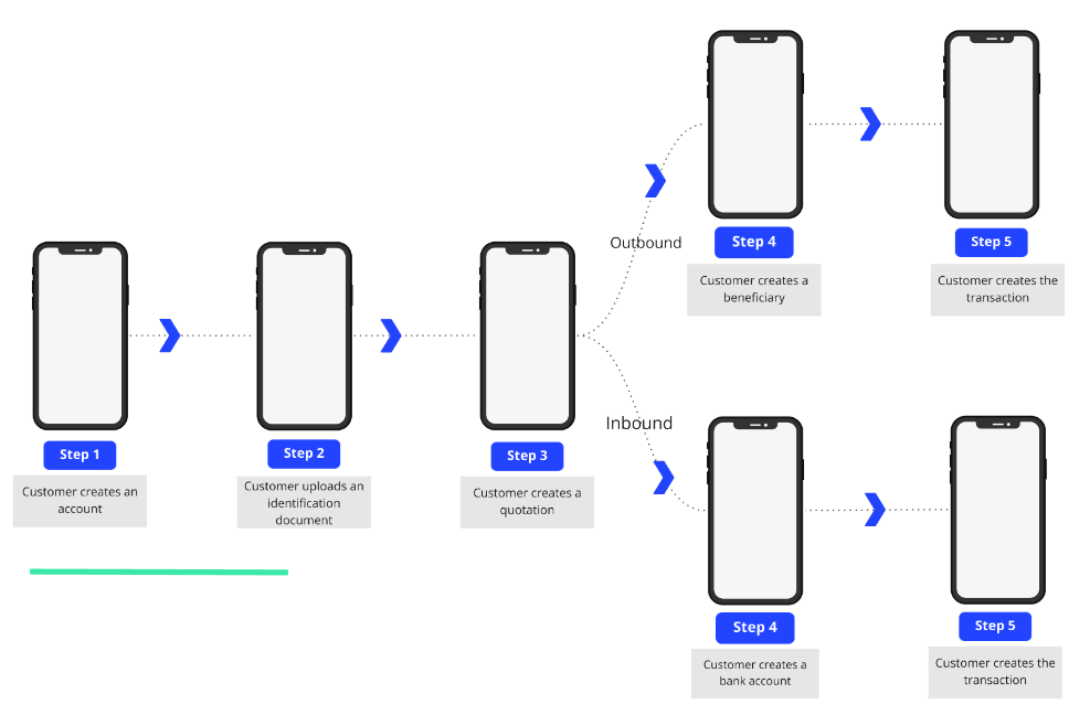
Regardless of which use case, the partner is going to use, some steps to be followed are quite similar. Below you can see what the steps are in the FXaaS flow:

Screen Steps
Updated 11 months ago
